Work / Case Study
Designing a Scalable Vision AI Platform for Real-World Operations
We partnered with Cynapse to modernise a complex Vision AI platform—simplifying workflows, standardising UI foundations, and enabling teams to act faster and with greater confidence at scale.
Challenge
Cynapse is a world-leading Vision AI vendor. As the platform matured — and the product transitioned to a modern React stack — the experience needed to catch up with the capability.
The existing UI was powerful, but it carried complexity: inconsistent patterns, a steeper learning curve for operators, and an information structure that didn’t always match real workflows. The goal was clear: modernise the interface and simplify key journeys without compromising depth — guided by user insight and usage data.
What we did
Mapped key personas, tasks, and workflows
Defined a clear, modern design language
Built reusable components in the MUI framework
Reworked navigation and information architecture
Simplified dashboards and core operating flows
Designed responsive layouts and dark mode
Partnered with engineering through React migration
“We partnered with Kamil and his team to elevate the user experience of our Vision AI platform and bring it to a more modern, user-centric standard. Kamil’s experience in complex B2B products showed immediately — he helped us move fast while staying focused on what mattered.
This collaboration showed the impact a senior strategic designer can have when a software company doesn’t yet have a mature in-house design function. We’d happily recommend Kamil for his clarity, speed, and collaborative approach.”

Based in Singapore with customers across four continents, Cynapse provides Vision AI software for high-stakes operational environments.
The platform supports smart cities, land transport, seaports, and airports — helping teams monitor activity, investigate incidents, and improve safety, security, and operational efficiency.
Cynapse is trusted by over 50 world-class organizations
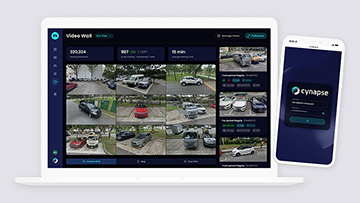
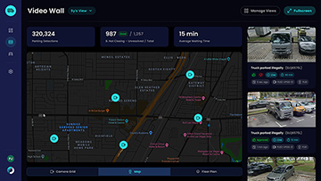
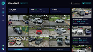
Enhancing readability and focus with dark mode
The platform is often used in operations rooms and low-light environments. Dark mode improved comfort, reduced glare, and made key UI elements easier to scan during long sessions.
It also helped unify the visual system and brought a more modern, cohesive feel across the product — without changing how teams work.

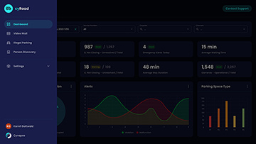
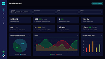
Tailoring the experience for core personas
Operators and administrators don’t come to the product for the same reasons — so we designed the landing experience around their priorities, not a generic “one-size-fits-all” dashboard.
By aligning layouts, navigation, and defaults to real usage patterns, the experience became faster to learn and easier to run day-to-day.
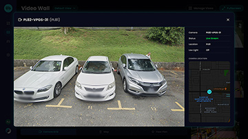
Improving object discovery with AI-powered text search
In analytics workflows, time-to-answer matters. We introduced AI-powered text search to help teams find objects and events faster — reducing clicks and shortening investigations.
The result was a more direct path from intent to insight, designed around how users actually search, filter, and validate what they’re seeing.
Standardising core UI components for scale
To support a faster build pace and a more consistent product, we rebuilt key UI patterns as a reusable component foundation.
By migrating to Material UI (MUI), we improved consistency, accessibility, and responsiveness — giving the team a scalable system to keep shipping without UX drift.
Valuable takeaways
Great B2B UX starts with role clarity. We shaped the experience around what each persona needs most: operators get quick access to live monitoring and action, while administrators get oversight, history, and control. When the default view matches the job-to-be-done, adoption gets easier and performance improves.
Fractional leadership works when it’s outcome-led. Rather than “design support”, the engagement focused on decisions, priorities, and shipping quality — using user insight and product signals to guide effort. The key is staying tightly aligned with engineering so improvements land in the product, not just in files.
Credits
Methods
- Benchmarking
- Client Interviews
- Competitor Analysis
- Design System Build
- Fractional Design Leadership
- Market Research
- Material UI Design
- Production-Ready Prototyping
- Rapid Prototyping
- Responsive Design
- UI Component Design
- User Experience Design