Work / Case study
Revitalising a consulting brand to enable organisational growth.
We worked with Flectēre to redefine their brand strategy and visual identity, and to give them a platform that would still hold up as the consultancy grew.
flectere.net
Flectēre
Singapore & Australia (Remote)
Product & Management Consulting

Challenge
Flectēre’s existing brand no longer reflected the maturity of the business, the clarity of its thinking, or the impact it was delivering for clients. The job was to move the brand on without losing what people already trusted and to build something that could grow with the company.
What we did
Audited the market and the competition
Interviewed founders to capture intent and direction
Facilitated focused remote brand workshops
Defined a clear brand strategy and positioning
Designed a distinctive visual identity system
Documented the brand for consistent application
“We partnered with Kamil and the form-three team to modernise our brand. The collaboration was straightforward and agile, and the output aligned very well with our story and future goals. I highly recommend form-three to businesses seeking results-driven designers with exceptional soft skills.”
“Teaming up with Kamil was an intuitive choice, given our previous collaboration. The entire process unfolded seamlessly, with the form-three team effortlessly adjusting to our preferred working style. This experience reaffirmed my confidence in turning to Kamil and his team for assistance in both Flectēre’s internal projects and extending their services to our clients.”


Flectēre is a product and technology consultancy. It helps organisations grow faster using data.
As the business evolved, the brand needed to move beyond early-stage positioning and reflect a more confident, scalable consulting model.
We worked out what made Flectēre different, turned that into a brand system and left them a base they could keep building on.
Flectēre collaborates with a diverse clientele, ranging from small startups to large enterprises.




Established best practices and documented the current state of the brand
A rebrand starts with reading the market so the result stands apart from the competition. This is followed by understanding the company itself: where it came from, where it is now and where it wants to go.
We interviewed the founding partners, Swati and Gireesh, one at a time. Those sessions settled the brief and the company story, which was what the rest of the work was built on.

Uncovered valuable insights and defined the brand platform
The second phase opened with a brand workshop with the founders to dig further, look at brands we admired and agree on a direction.
Afterwards we tightened the documentation and started on the positioning. Working directly with the founders, we turned what came out of the workshop into a brand platform.
Developed a modern and differentiated visual identity
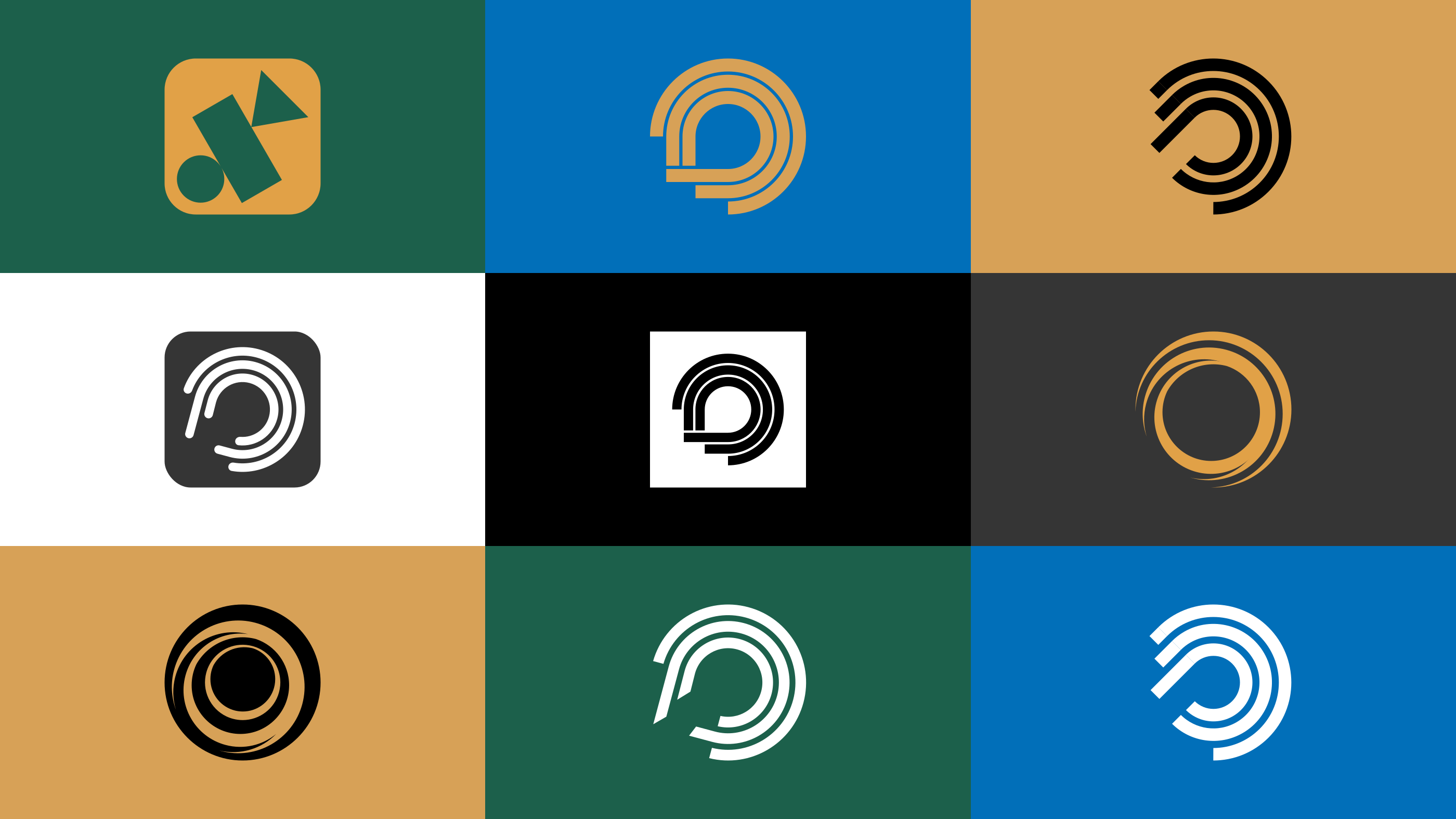
In the third phase we developed several versions of the logo and the colour palette. We tested them with the founders and against other brands in the sector, and one came out ahead.
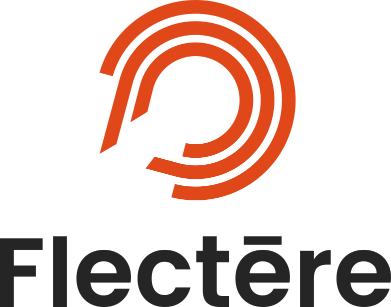
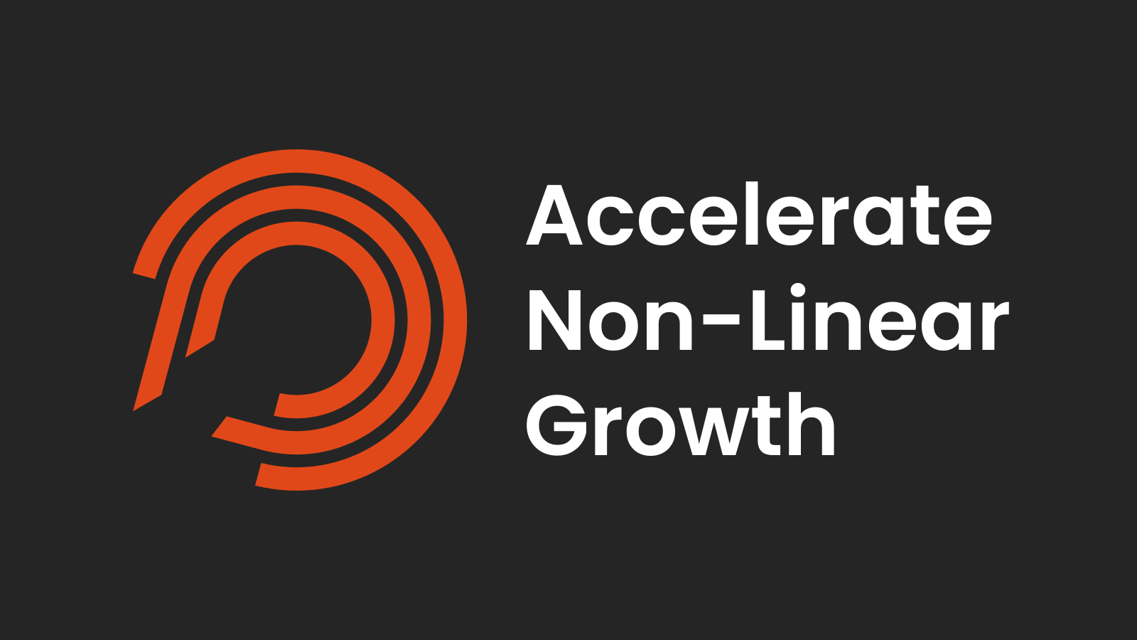
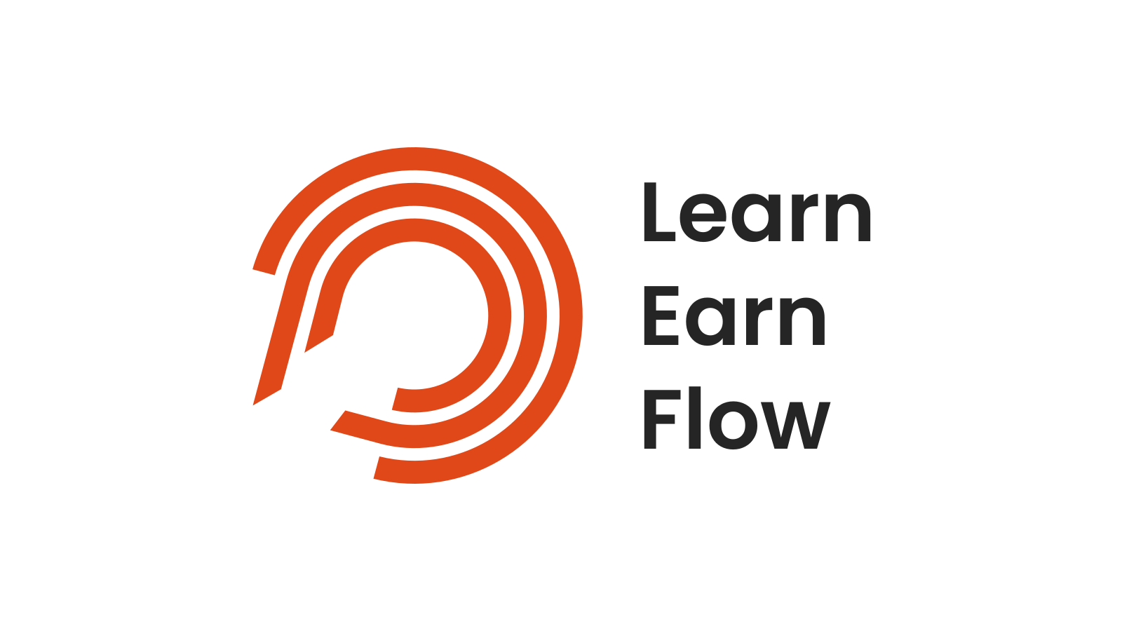
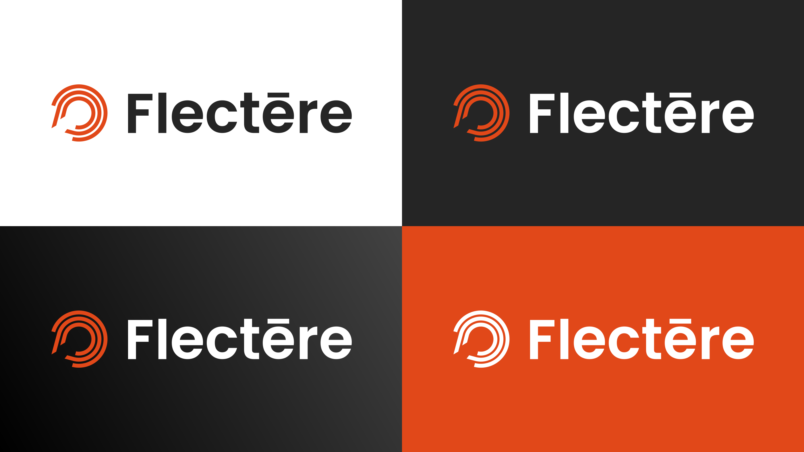
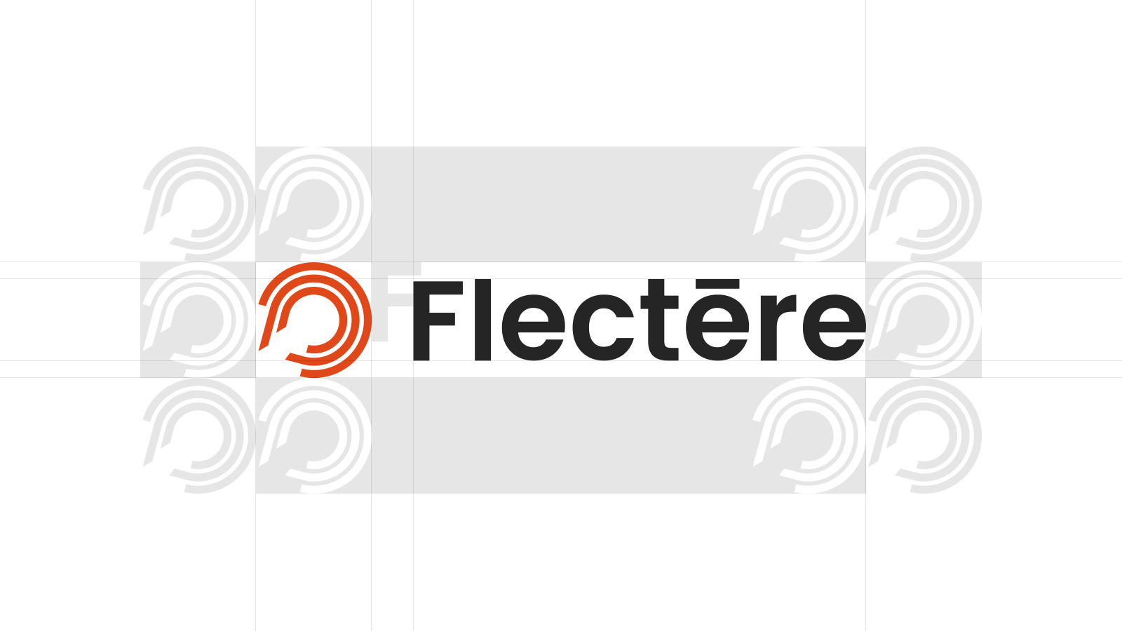
The logo pairs a symbol with a wordmark. The symbol’s three circular lines stand for learn, earn and flow. The circles are left unclosed to represent open collaboration.
The palette is flame orange, eerie black and pure white. The typeface is Poppins, from Google Fonts, which keeps the whole thing clear and current.
Turned the work into a brand book
The last phase was the brand book. It covered the company itself: its founding story, what it achieved, what it offered and how, the industries it worked in, its partners and customers, and where it sat against the competition.
Then, the brand platform: name, vision, mission, values, who it is for, tagline and the words to use.
The last chapter was the visual identity: logo, wordmark, symbol, colour, typography, layout, imagery and icons, each with examples of how it should be used.
The brand book worked inside the company as well as outside it, for collaborators, partners and people thinking about joining.



Valuable takeaways
Interview stakeholders one at a time before putting them in a room together. Hear what each of them actually thinks, and the group session then has something to align on.
Write workshop material as plain text. Tech clients in particular would rather have it fast than have it look finished, and polishing work in progress is time nobody gets back.
Credits
Swati Shekhar
Founding Collaborator
Gireesh Ramji
Founding Collaborator
Methods
- Market & Competitor Analysis
- Stakeholder Interviews
- Brand Strategy Definition
- Remote Brand Workshops
- Competitive Differentiation
- Visual Identity Development
- Brand Guidelines & Documentation
- Brand Book Development